From functional to frictionless
Maturing a two-sided music platform
As lead designer, I transformed a basic platform for independent artists and playlist curators into a modern, intuitive product by removing critical workflow friction, clarifying overlapping user roles, and shaping monetization that supported revenue growth.
Impact note: Due to commercial confidentiality, detailed conversion and revenue figures cannot be shared. Internal analytics and stakeholder feedback indicated improved completion of key journeys, increased platform activity, and stronger monetization performance after launch.
The product and people
DailyPlaylists is a music submission platform that helps independent musicians get their work in front of playlist curators. In its early day, DailyPlaylists had an attractive public-facing website, but the product experience behind it was fragmented: artists struggled to submit music, curators lacked essential workflow tools, and users who held both roles could easily lose their context.
Artists
Artists need a fast, trustworthy way to find and submit tracks to relevant playlists.
User story: As an artist, I want to easily submit my songs to Spotify playlists, so that I can promote my music and increase my listeners.
Curators
Curators need efficient tools to manage playlists, assess submissions, and respond to artists.
User story: As a curator, I want to find the right music that matches my playlists, so that I can grow my playlists and earn money.
The challenge
The platform was usable, but its hierarchy, copy, role switching, and core workflows were underdeveloped. As a result, the experience felt fragmented and its value was harder to understand.
My role
Lead Product Designer, end to end
I led the transformation from audit to shipped product: I conducted a platform audit, user and market research, defined user journeys, optimized the information architecture, interaction and UI design, built a design system, tested the product, collaborated closely with developers and stakeholders.
I helped an early-stage team build UX practice and product clarity while moving the platform from a marketing-led website toward a usable product ecosystem.


Discovery, evidence & priorities
I began with a full platform audit to understand where the experience was breaking down across the artist and curator journeys. The product was functional, but core tasks were harder than they needed to be: the interface lacked clear hierarchy, key actions were fragmented across platforms, and the value of different areas of the product was not always obvious.
The audit, user research, and product data revealed five areas with the greatest potential to improve both the user experience and the business:
Homepage conversion: Visitors received little guidance beyond the hero section. The value proposition, next steps, and calls to action did not give artists or curators a compelling reason to continue.
Artist submission: Submitting a song required artists to leave DailyPlaylists, locate their track in Spotify, copy its link, return to the platform, and paste it into the form. Internal data showed that this external handoff caused at least 60% drop-off in a critical journey.
Curator workflow: Curators could receive submissions, but lacked tools needed to manage them effectively, such as submission history and the ability to decline a track with useful feedback.
Role clarity: Many users were both artists and curators. A subtle tab change did not provide enough context to distinguish the two modes, making it easy to lose track of the task and role they were currently operating in.
Monetization: The platform needed a clearer way to communicate paid value. Users needed to understand what each tier offered, why it mattered, and when an upgrade was relevant to their goals.
Setting the priorities
I prioritized the moments where friction interrupted the platform’s core exchange: artists submitting music, and curators reviewing it. In parallel, I improved role clarity and the product’s value communication so that the platform could guide users more confidently from first visit to meaningful action and support monetization without compromising the experience.
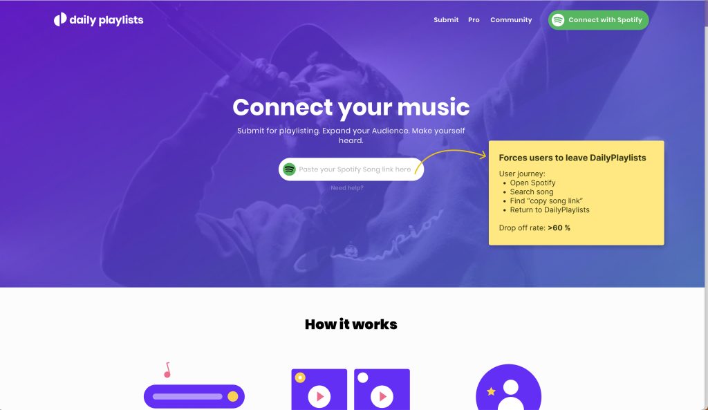
High drop-off rate led to low submissions, low number of active users and below target revenue
The product decisions
The audit surfaced many opportunities. I focused on the decisions that would make the platform’s core exchange feel simpler and more valuable: artists submitting music, curators managing submissions, and both groups understanding the platform’s paid offering.
1. Reduced submission friction
The problem
Submitting a track required artists to leave DailyPlaylists, find their song on Spotify, copy the link, return to the platform, and paste it into the submission form. This external handoff caused at least 60% drop-off at a critical moment in the journey.
The decision
I led the integration of Spotify search directly into the submission flow, allowing artists to find and select their track without leaving DailyPlaylists.
Why it mattered
The experience changed from a fragmented, cross-platform workaround into one continuous task. Removing this interruption made it easier for artists to reach the moment of value: submitting their music to relevant curators.
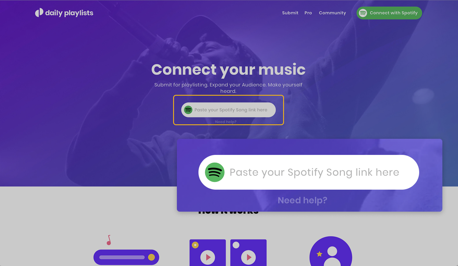
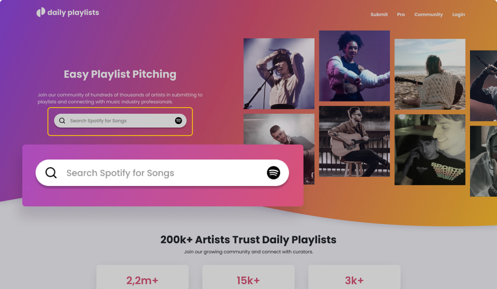
Before & after: Before users had to paste their song link into DailyPlaylists, after then could search directly in the platform
2. Reframed a dual-role product
The problem
Many users used DailyPlaylists as both artists and curators. Previously, the distinction between these modes relied on a subtle tab change, making it easy to lose context and difficult to understand which tasks belonged to each role.
The decision
I created distinct artist and curator experiences with task-specific navigation, clearly separated workflows, and persistent visual cues that made the active role immediately recognizable.
Why it mattered
Users no longer had to infer where they were or adapt one mental model to two very different jobs. Artists could focus on promoting music; curators could focus on managing playlists and reviewing submissions while moving between both roles when needed.
3. Made monetization a clear value decision
The problem
The platform needed to generate revenue, but paid tiers and their benefits needed to be understandable enough for users to make an informed choice.
The decision
Working closely with stakeholders, I shaped how plans, benefits, and upgrade opportunities appeared across the product. This included clearer tier comparison, more precise plan language, and upgrade prompts placed at relevant moments in the journey.
Why it mattered
Rather than treating payment as an interruption, the experience connected each tier to a user need and its resulting value. That gave users a clearer basis for choosing a plan while supporting the platform’s monetization goals.
System & delivery
The redesign needed to do more than improve individual screens. It needed to give DailyPlaylists a consistent foundation for evolving a product with two distinct user roles, new features, and an early-stage development team.
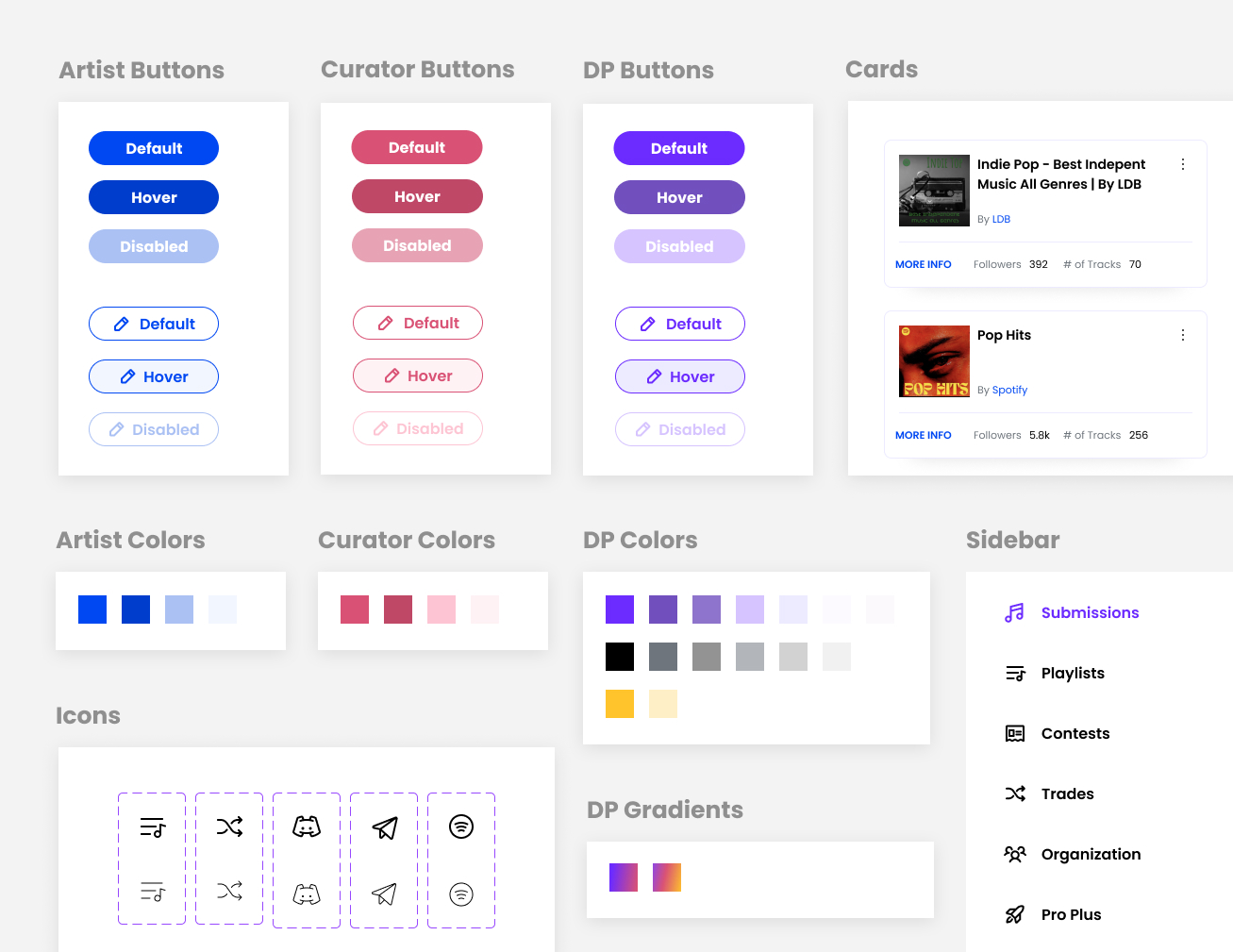
I established a shared design language across artist and curator experiences: reusable interface components, clear interaction patterns, and consistent rules for hierarchy, terminology, and system states. This meant the two flows could feel purpose-built for their users while still belonging to one coherent product.
For developers, the system created a clearer implementation language. Reusable patterns reduced ambiguity in handoff, made decisions easier to apply consistently, and gave the team a foundation for building future functionality without recreating the experience from scratch.
Outcomes & reflection
The redesign gave DailyPlaylists a clearer, more complete product experience for both sides of the platform. Artists could search for and submit tracks without leaving the product, while curators gained a more structured workflow for reviewing and managing submissions. Distinct artist and curator modes made it easier for dual-role users to understand their current context and move confidently between tasks.
Monetization became part of the product experience rather than a disconnected pricing moment. Clearer plan language, tier comparison, and better-timed upgrade opportunities helped users understand the value of each option before being asked to pay.
Business impact
Detailed conversion and revenue figures are confidential. However, internal analytics and stakeholder feedback showed clear improvement after the redesign: more visitors progressed beyond the homepage, key artist and curator journeys were completed more successfully, and overall platform activity increased.
The redesigned monetization experience also supported successful premium-submission sales and contributed to increased revenue. Together, these outcomes demonstrated that a clearer product experience could improve both user engagement and commercial performance.
What I learned
This project reinforced that a two-sided platform succeeds when both sides of the exchange can act effectively: making submission easier for artists only creates value if curators can efficiently discover, assess, and respond to music.
It also showed that role clarity is not simply a visual-design concern. It requires distinct tasks, navigation, language, and feedback so users always understand what they can do in their current mode.
Finally, monetization works best when it follows demonstrated value. Users should understand what a paid tier helps them achieve before they encounter its price.
